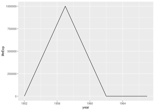
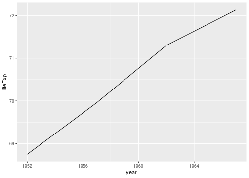
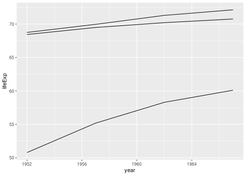
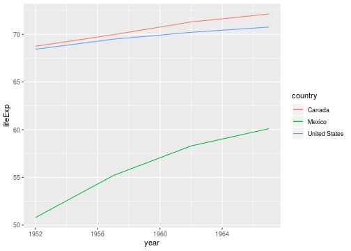
class: center, middle, inverse, title-slide # Tools for collaborating in teams ## (sample solution for the test case) --- ## A test case Using the gapminder data provided, we are asked to: 1. Visualize life expectancy over time for Canada in the 1950s and 1960s using a line plot. 2. Something is clearly wrong with this plot! Turns out there's a data error in the data file: life expectancy for Canada in the year 1957 is coded as `999999`, it should actually be `69.96`. Make this correction. 3. Visualize life expectancy over time for Canada again, with the corrected data. --- ## Step-by-step plan of work 1. Read the data 2. Focus on values of Canada 3. Visualize the values for Canada 4. See whether we can find the problem 5. ... then we'll see ... --- ## Reading the data ```r life5060 <- read.csv("https://raw.githubusercontent.com/Stat480-at-ISU/materials-2020/master/01-collaborative_environment/data/gapminder-5060.csv") head(life5060) ``` ``` ## country continent year lifeExp pop gdpPercap ## 1 Afghanistan Asia 1952 28.801 8425333 779.4453 ## 2 Afghanistan Asia 1957 30.332 9240934 820.8530 ## 3 Afghanistan Asia 1962 31.997 10267083 853.1007 ## 4 Afghanistan Asia 1967 34.020 11537966 836.1971 ## 5 Albania Europe 1952 55.230 1282697 1601.0561 ## 6 Albania Europe 1957 59.280 1476505 1942.2842 ``` --- ## Focus on the values for Canada ```r canada <- life5060 %>% dplyr::filter(country == "Canada") head(canada) ``` ``` ## country continent year lifeExp pop gdpPercap ## 1 Canada Americas 1952 68.75 14785584 11367.16 ## 2 Canada Americas 1957 999999.00 17010154 12489.95 ## 3 Canada Americas 1962 71.30 18985849 13462.49 ## 4 Canada Americas 1967 72.13 20819767 16076.59 ``` --- ## Visualize Draw a line for the life expectancy in Canada ```r canada %>% ggplot(aes(x = year, y = lifeExp)) + geom_line() ``` <!-- --> --- ## Find the problematic value and fix it ```r canada %>% dplyr::filter(year == 1957) ``` ``` ## country continent year lifeExp pop gdpPercap ## 1 Canada Americas 1957 999999 17010154 12489.95 ``` ```r canada_fixed <- canada %>% mutate( lifeExp = replace(lifeExp, year==1957, 69.96) ) ``` --- ## visualize the fixed data ```r canada_fixed %>% ggplot(aes(x = year, y = lifeExp)) + geom_line() ``` <!-- --> --- ## ... on to the stretch goal ... Add lines for Mexico and the US ```r canada_fixed %>% ggplot(aes(x = year, y = lifeExp, group=country)) + geom_line() + geom_line(data = life5060 %>% dplyr::filter(country %in% c("United States", "Mexico"))) ``` <!-- --> --- ## ... on to the stretch goal ... Add lines for Mexico and the US, color lines by country and add a legend ```r canada_fixed %>% ggplot(aes(x = year, y = lifeExp, colour=country)) + geom_line() + geom_line(data = life5060 %>% dplyr::filter(country %in% c("United States", "Mexico"))) ``` <!-- --> --- ## How reproducible is this solution? 1. Navigate to https://github.com/stat480-at-isu/materials 2. Open the folder `01-collaborative_environment` 3. Download the file `02-test-case_solution.Rmd` 3. Open the file in RStudio. 4. "Knit" the file. --- ## R Markdown - code and text/documentation are interwoven: reproducible and self-documenting. - extend or refine analyses by copying and modifying code blocks. - disseminate your work by sharing the RMarkdown file