class: center, middle, inverse, title-slide # Graphics in ggplot2 --- class: inverse, center, middle # Questions for the <br>fbi data --- ## Plan for answers <br> Explore how one (or more) variables are distributed: - barchart or histogram <br> Explore how two variables are related: - scatterplot, boxplot, tile plot <br> Explore how two variables are related, conditioned on other variables: - facetting, color & other aesthetics --- ## Getting ready Load libraries: ```r library(ggplot2) # not found? run install.packages("ggplot2") library(classdata) # not found? run devtools::install_github("haleyjeppson/classdata") ``` --- ## Different version of the data We will use a different shape of the `fbi` data - a wide form: ```r library(classdata) str(fbiwide) ``` ``` ## 'data.frame': 2907 obs. of 12 variables: ## $ State : chr "Alabama" "Alabama" "Alabama" "Alabama" ... ## $ Abb : chr "AL" "AL" "AL" "AL" ... ## $ Year : int 1961 1962 1963 1964 1965 1966 1967 1968 1969 1970 ... ## $ Population : int 3302000 3358000 3347000 3407000 3462000 3517000 3540000 3566000 3531000 3444165 ... ## $ Aggravated.assault : int 4255 3995 4755 5555 5162 6249 6495 6009 6415 7413 ... ## $ Burglary : int 11205 11722 12614 15898 16398 18551 20227 22403 23559 26739 ... ## $ Larceny.theft : int 18801 21306 22874 26713 28115 30583 31682 34508 36644 40779 ... ## $ Legacy.rape : int 252 218 192 397 367 341 371 396 494 637 ... ## $ Motor.vehicle.theft: int 2535 2801 3033 3679 3702 4606 5170 6086 6045 7696 ... ## $ Murder : int 427 316 340 316 395 384 415 421 485 404 ... ## $ Rape : int NA NA NA NA NA NA NA NA NA NA ... ## $ Robbery : int 630 754 828 992 992 1124 1167 1462 1448 1731 ... ``` <br/> ... not able to install devtools or the classdata package? ```r fbiwide <- read.csv("https://raw.githubusercontent.com/Stat480-at-ISU/materials-2020/master/02_r-intro/data/fbiwide.csv") ``` --- ## Scatterplots - need two continuous variables - we'll be using the `ggplot2` framework for plotting <br/> 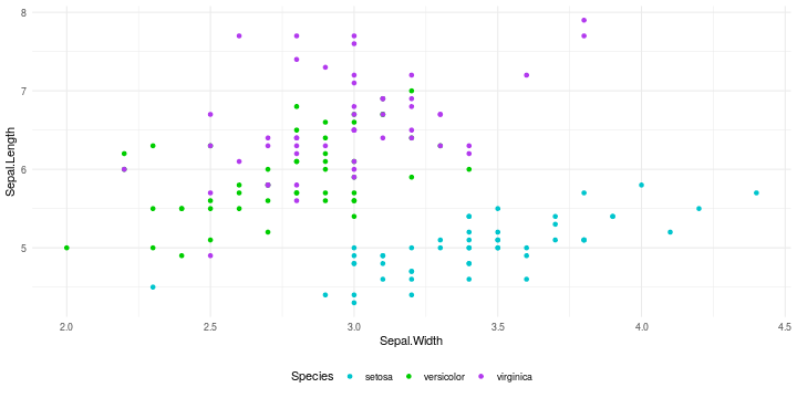<!-- --> --- class: inverse, center, top background-image: url(https://raw.githubusercontent.com/allisonhorst/stats-illustrations/master/rstats-artwork/ggplot2_exploratory.png) background-size: 550px background-position: 50% 80% # Why ggplot2? --- background-image: url(https://raw.githubusercontent.com/rstudio/hex-stickers/master/PNG/ggplot2.png) background-size: 120px background-position: 85% 90% ## Why `ggplot2` - Wildly popular package for statistical graphics: - over **2.5 million downloads** from CRAN in 2017 (several thousand times per day) - Developed by Hadley Wickham (An ISU Alumni) - Designed to adhere to good graphical practices (uses the grammar graphics) - Constructs plots using the concept of layers - Supports a wide variety plot types and extensions - http://ggplot2.org/book/ or Hadley's book *ggplot2: Elegant Graphics for Data Analysis* for reference --- ## Grammar of graphics - Developed by Leland Wilkinson - Think about graphical forms rather than a limited set of graphs - Different types of graphs may appear completely distinct, but share many common elements. - By making different visual choices, you can use graphs to highlight different aspects of the same data. For example, here are three ways of displaying the same data: <img src="02_r-graphics_files/figure-html/plots-3-1.png" /> ??? - Charts are instances of much more general objects - An abstraction which makes thinking, reasoning, and communicating graphics easier --- ## A layered grammar of graphics A graphical representation (plot) in ggplot2 consists of: 1. **default data and mappings** (`aes`): data variables are mapped to visual properties of the graphical elements 2. **one or more layers**: - geometric element (`geom`, such as point, line, rectangle, text, ...), - statistical transformation (`stat`, such as identity, counts, bins, ...), - position adjustment, - (optional) one dataset and set of aesthetic mappings 3. **scales**: map values in the data space to values in an aesthetic space 4. **coordinate system** (`coord`): normally Cartesian, but could use polar coordinates for pie charts or different mapping coordinates 5. **facetting**: for small multiples (subsets) and their arrangement 6. **theme**: fine-tune display items, such as font and its size, color of background, margins, ... --- ## Scatterplots in `ggplot2` - `aes` allows us to specify mappings - scatterplots need a mapping for `x` and a mapping for `y`: <br/> ``` ggplot(data = fbiwide, aes(x = Burglary, y = Murder)) + geom_point() ``` ``` ggplot(data = fbiwide, aes(x = log(Burglary), y = log(Murder))) + geom_point() ``` ``` ggplot(data = fbiwide, aes(x = log(Burglary), y = log(Motor.vehicle.theft))) + geom_point() ``` --- ## Interpreting Scatterplots - Big patterns - Form and direction - Strength - Small patterns - Deviations from the pattern - Outliers --- <br/><br/> #### **Form** Is the plot linear? Is the plot curved? Is there a distinct pattern in the plot? Are there multiple groups? #### **Strength** Does the plot follow the form very closely? Or is there a lot of variation? #### **Direction** Is the pattern increasing? Is the plot decreasing? - **Positively**: Above (below) average in one variable tends to be associated with above (below) average in another variable. - **Negatively**: Opposite pattern. --- background-image: url("images/positive.png") background-size: width=2000 <br/><br/> -- .indent-left[] .indent-right[ #### 1. <font color="darkorange">Form: Linear</font> #### 2. <font color="darkorange">Strength: Strong, very close to a straight line.</font> #### 3. <font color="darkorange">Direction: Two variables are positively associated.</font> #### 4. <font color="darkorange">No outliers.</font> ] --- background-image: url("images/negative.png") background-size: width=2000 <br/><br/><br/><br/><br/><br/><br/><br/><br/><br/> -- .indent-left[] .indent-right[ #### 1. <font color="darkorange">Form: Roughly linear, two distinct groups (more than 40% and less than 40%.)</font> #### 2. <font color="darkorange">Strength: not strong. Data points are scattered. </font> #### 3. <font color="darkorange">Direction: Negatively Associated. </font> #### 4. <font color="darkorange">Outliers: None.</font> ] --- ## Aesthetics Can map other variables to size or colour <br/> ``` ggplot(aes(x = log(Burglary), y = log(Motor.vehicle.theft), colour=State), data=fbiwide) + geom_point() ggplot(aes(x = log(Burglary), y = log(Motor.vehicle.theft), colour=Year), data=fbiwide) + geom_point() ``` ``` ggplot(aes(x = log(Burglary), y = log(Motor.vehicle.theft), size=Population), data=fbiwide) + geom_point() ``` <br/> other aesthetics: shape --- class: inverse, center, top background-image: url(https://raw.githubusercontent.com/allisonhorst/stats-illustrations/master/rstats-artwork/ggplot2_masterpiece.png) background-size: 650px background-position: 50% 80% # Make your first figure --- ## We begin with the data ```r ggplot(data = fbiwide) ``` <!-- --> --- ## Then we specify the aesthetic mappings ```r ggplot(data = fbiwide, aes(x = Burglary, y = Murder)) ``` <!-- --> ??? or what relationships we want to see --- ## Then we choose a geom ```r ggplot(data = fbiwide, aes(x = Burglary, y = Murder)) + geom_point() ``` 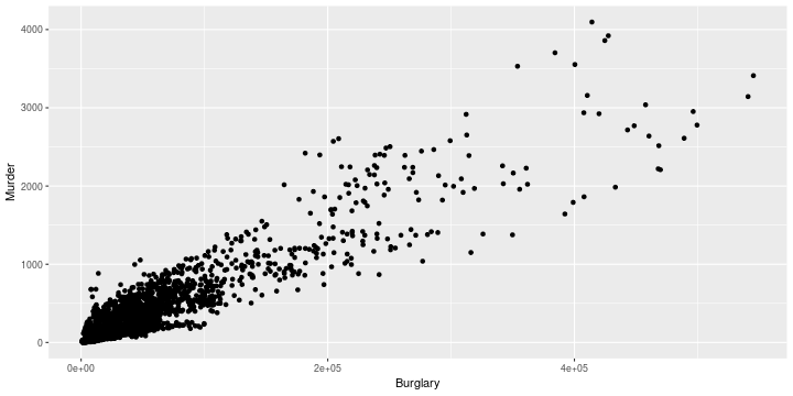<!-- --> --- ## We can add additional aesthetics ```r ggplot(data = fbiwide, aes(x = Burglary, y = Murder)) + geom_point(aes(color = State)) ``` 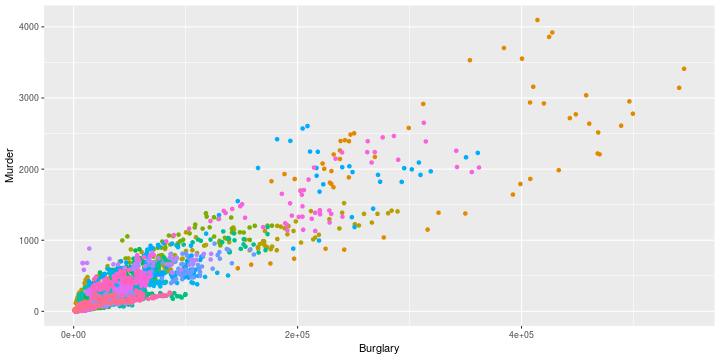<!-- --> ??? we could add another layer --- ## Mapping aesthetics vs setting aesthetics ```r ggplot(data = fbiwide, aes(x = Burglary, y = Murder)) + geom_point(color = "turquoise3", alpha = .4) ``` 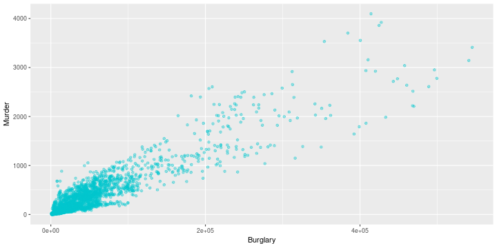<!-- --> --- ## Transform coordinates ```r ggplot(data = fbiwide, aes(x = Burglary, y = Murder)) + geom_point(color = "turquoise3", alpha = .4) + scale_x_log10() + scale_y_log10() ``` 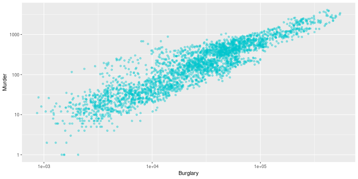<!-- --> --- class: yourturn .center[ # Your turn ] - Work through each of the example plots (from slides 11 & 16) - Try variations to answer your questions --- ## Resources - reference/document: http://ggplot2.tidyverse.org/reference/ - RStudio cheat sheet for [ggplot2](https://www.rstudio.com/wp-content/uploads/2015/03/ggplot2-cheatsheet.pdf) - Artwork by [@allison_horst](https://twitter.com/allison_horst?ref_src=twsrc%5Egoogle%7Ctwcamp%5Eserp%7Ctwgr%5Eauthor)