class: center, middle, inverse, title-slide # Graphics in ggplot2 --- ## Plan for answers 1. Explore how one (or more) variables are distributed: - barchart or histogram 2. Explore how two variables are related: - scatterplot, boxplot, tile plot 3. Explore how two variables are related, conditioned on other variables: - facetting, color & other aesthetics <br/> > Look at 3 next, then come back to 1 and 2. --- ## Getting ready Load libraries: ```r library(ggplot2) # not found? run install.packages("ggplot2") library(classdata) # not found? run devtools::install_github("haleyjeppson/classdata") ``` <br/><br/> ... not able to install devtools or the classdata package? ```r fbiwide <- read.csv("https://raw.githubusercontent.com/Stat480-at-ISU/materials-2020/master/02_r-intro/data/fbiwide.csv") ``` --- class: inverse, center, middle # Facetting --- ## Facetting Can facet to display plots for different subsets: `facet_wrap`, `facet_grid` ```r ggplot(data=fbiwide, aes(x = Year, y = Murder)) + geom_point() + facet_wrap(~State) ``` 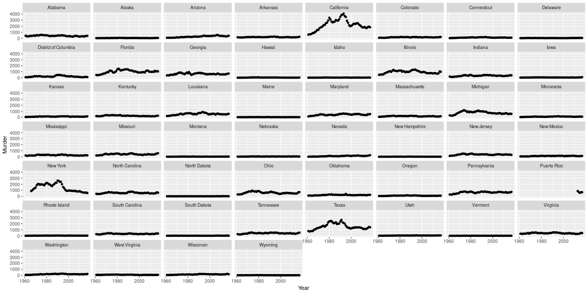<!-- --> --- ## Setup of `facet_wrap` and `facet_grid` - `facet_grid` has formula specification: `rows ~ cols` - `facet_wrap` has specification `~ variables` - multiple variables (in either specification) are included in the form of a sum - i.e. `rowvar1 + rowvar2 ~ colvar1+ colvar2` - no variable (in `facet_grid`) is written as `.` - i.e. `rowvar ~ .` are plots in a single column. --- class: yourturn .center[ # Your turn ] Use the `fbiwide` data from the package `classdata` for this your turn. - Plot the number of car thefts by year for each state (facet by state). - The numbers are dominated by the number of thefts in California, New York, and Texas. Use a log-scale for the y-axis. Does that help? - Another approach to fix the domination by CA, TX and NY: Read up on the parameters in `facet_wrap` to find a way to give each panel its own scale. Comment on the difference in the results. --- background-image: url(https://raw.githubusercontent.com/allisonhorst/stats-illustrations/master/rstats-artwork/ggplot2_masterpiece.png) background-size: 550px background-position: 50% 90% ## Facets vs. aesthetics? - Will need to experiment as to which one answers your question/tells the story best - Rule of thumb: comparisons of interest should be close together --- class: inverse, center ## Boxplots 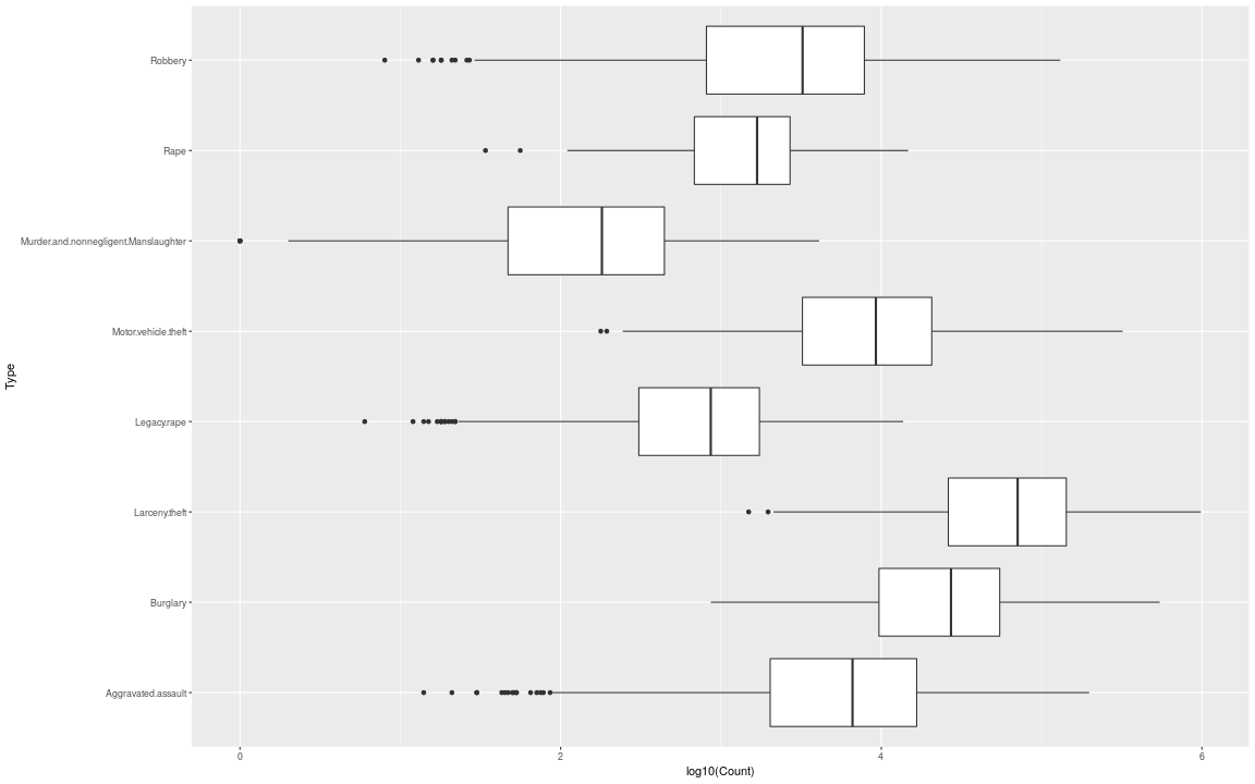<!-- --> --- ## Boxplot definition - definition by J.W. Tukey (1960s, EDA 1977) 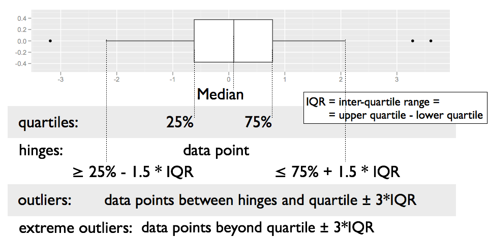 --- ## Boxplots - are used for group comparisons and outlier identifications - usually only make sense in form of side-by-side boxplots. - `geom_boxplot` in ggplot2 needs `x` and `y` variable - `y` is measurement, - `x` is categorical <br/> ``` ggplot(data = fbi, aes(x = Type, y = log10(Count))) + geom_boxplot() + coord_flip() ``` --- class: yourturn .center[ # Your turn ] - Using ggplot2, draw side-by-side boxplots of the number of robberies by state. Use a log transformation on y and compare results. - **Stretch goal:** Compare rates of robberies by state, i.e. adjust robberies by the state population. Then plot side-by-side boxplots. --- ## Boxplots **Pros** - Symmetry vs Skewness - Outliers - Quick Summary - Comparisons across multiple Treatments (side by side boxplots) <br/> **Cons** - Boxplots hide multiple modes and gaps in the data --- class: inverse, center, middle # Univariate plots ## Histograms & barcharts --- ## Histograms ```r ggplot(fbiwide, aes(x = Motor.vehicle.theft)) + geom_histogram(binwidth = 5000) + ggtitle("binwidth = 5000") ``` 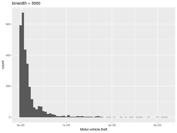<!-- --> --- ## Histograms ```r ggplot(fbiwide, aes(x = Motor.vehicle.theft)) + geom_histogram(binwidth=1000) + ggtitle("binwidth = 1000") ``` 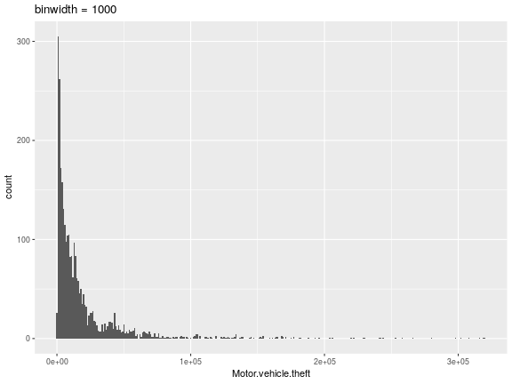<!-- --> --- ## Barchart ```r ggplot(fbi, aes(x = Type)) + geom_bar(aes(weight= Count)) + coord_flip() ``` 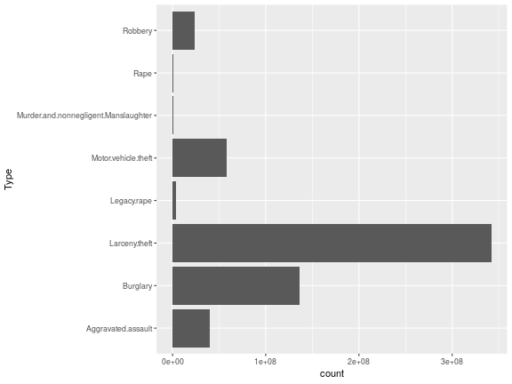<!-- --> --- ## Histograms and barcharts What do we look for? - Symmetry/Skewness - Modes, Groups (big pattern: where is the bulk of the data?) - Gaps & Outliers (deviation from the big pattern: where are the other points?) For the histogram, always choose the binwidth consciously In a barchart, choose the order of the categories consciously (later) --- class:yourturn .center[ ## Your turn ] - Use the `fbi` data set to draw a barchart of the variable `Violent Crime`. ```r fbi <- read.csv("https://raw.githubusercontent.com/Stat480-at-ISU/materials-2020/master/02_r-intro/data/fbi.csv") ``` - Make the height of the bars dependent on the number of reports (use `weight`). - Then facet by type (does the result match your expectation? good! get rid of facetting). - Color bars by `Type`. - Use the `fbi` data set to draw a histogram of the number of reports. - Facet by type, make sure to use individual scales for the panels. --- ## Resources - reference/document: http://ggplot2.tidyverse.org/reference/ - RStudio cheat sheet for [ggplot2](https://www.rstudio.com/wp-content/uploads/2015/03/ggplot2-cheatsheet.pdf) - Artwork by [@allison_horst](https://twitter.com/allison_horst?ref_src=twsrc%5Egoogle%7Ctwcamp%5Eserp%7Ctwgr%5Eauthor)