class: center, middle, inverse, title-slide # Visualizing factor variables --- class: inverse ## Visualizing factors <br/> ### Outline: - review: factors in bar charts & factors in boxplots - use factors in aesthetics (`color`, `fill`, `shape`) or for facetting - always make sure that the order in factors is sensible! - visualizing 2+ factors --- ## ⚠️ factors in boxplots ⚠️ boxplots in ggplot2 only work properly if the x variable is a character or a factor: ```r twoyear <- dplyr::filter(gss_cat, year %in% c(2000, 2014)) ``` .pull-left[ ```r ggplot(data = twoyear, aes(x = year, y = tvhours)) + geom_boxplot() ``` 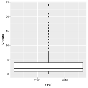<!-- --> ] .pull-right[ ```r ggplot(data = twoyear, aes(x = factor(year), y = tvhours)) + geom_boxplot() ``` 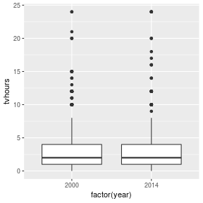<!-- --> ] --- ## ⚠️ factors in bar charts ⚠️ A barchart can also provide us with a quick summary *provided* the <br> levels have values. .pull-left[ ```r ggplot(gss_cat, aes(race)) + geom_bar() ``` 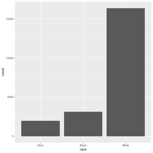<!-- --> ] .pull-right[ ```r ggplot(gss_cat, aes(race)) + geom_bar() + scale_x_discrete(drop = FALSE) ``` 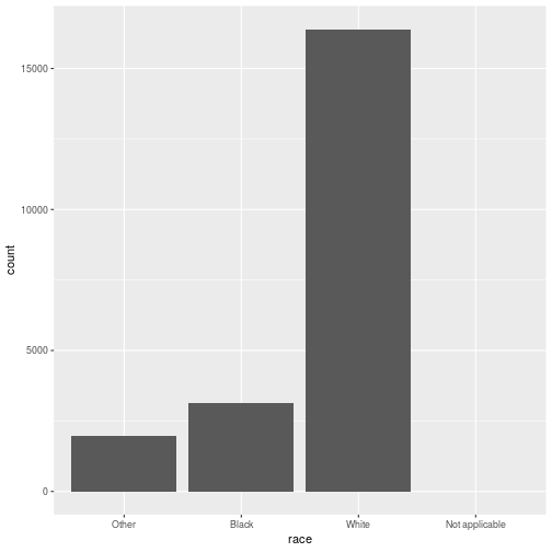<!-- --> ] --- ## ⚠️ factors for fill color ⚠️ Area plots (e.g. histograms & barcharts) use aesthetic `fill` for showing colored areas & only factor variables can be mapped to `fill` .pull-left[ ```r ggplot(gss_cat, aes(x = marital)) + geom_bar(aes(fill=year)) # nothing happens ``` 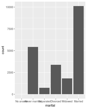<!-- --> ] .pull-right[ ```r ggplot(gss_cat, aes(x = marital)) + geom_bar(aes(fill=factor(year))) # not sensible, but works ``` 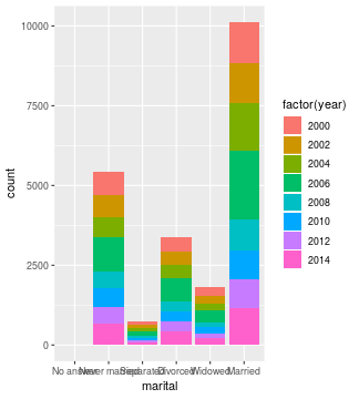<!-- --> ] --- ## Ex: Survival on the Titanic The object `titanic` is a table of a break down of survival of passengers and crew on board the Titanic by gender and age. ```r # devtools::install_github("haleyjeppson/classdata") library(classdata) data("titanic", package = "classdata") head(titanic) ``` ``` ## Class Sex Age Survived ## 1 3rd Male Child No ## 2 3rd Male Child No ## 3 3rd Male Child No ## 4 3rd Male Child No ## 5 3rd Male Child No ## 6 3rd Male Child No ``` --- ## Ex: Survival on the Titanic Barcharts of all 4 variables: `Survived`, `Sex`, `Class`, and `Age` .pull-left[ ```r ggplot(titanic, aes(x = Survived)) + geom_bar() ``` 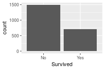<!-- --> ```r ggplot(titanic, aes(x = Sex)) + geom_bar() ``` 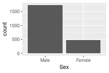<!-- --> ] .pull-right[ ```r ggplot(titanic, aes(x = Class)) + geom_bar() ``` 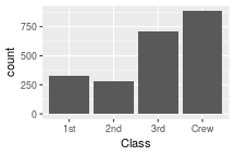<!-- --> ```r ggplot(titanic, aes(x = Age)) + geom_bar() ``` 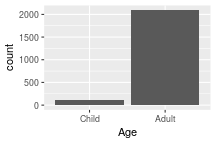<!-- --> ] --- ## Ex: Survival on the Titanic Add `fill = Survived` and `position="fill"` (not an aesthetic!) .pull-left[ ```r ggplot(titanic, aes(x = Survived, fill=Survived)) + geom_bar(position="fill") ``` 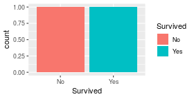<!-- --> ```r ggplot(titanic, aes(x = Sex, fill=Survived)) + geom_bar(position="fill") ``` 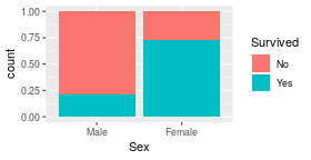<!-- --> ] .pull-right[ ```r ggplot(titanic, aes(x = Class, fill=Survived)) + geom_bar(position="fill") ``` <!-- --> ```r ggplot(titanic, aes(x = Age, fill=Survived)) + geom_bar(position = "fill") ``` <!-- --> ] --- class: inverse, center, middle # What if we have <br> more than 2 factors? --- ## 2+ factor variables Besides facetting and position, use **mosaic plots** - there are [extension packages](https://www.ggplot2-exts.org/gallery/) for `ggplot2`, e.g. `ggmosaic` <br/> <!-- --> --- ## other `ggplot2` [Extension packages](https://www.ggplot2-exts.org/gallery/) .pull-left[ gganimate <img src="images/gganimate.gif" width = "90%"> cowplot <img src="images/cowplot.png" width = "90%"> ] .pull-right[ gggenes <img src="images/gggenes.png" width = "90%"> <br/> tvthemes <img src="images/tvthemes.png" width = "90%"> ] --- class: inverse, center, middle # Returning to our example... --- ## Ex: Survival on the Titanic ... as a mosaic plot! ```r library(ggmosaic) ggplot(data = titanic) + geom_mosaic(aes(x = product(Sex), fill=Survived, weight=1)) + facet_grid(Age~Class) ``` <!-- --> --- class: yourturn .center[ # Your turn ] For this your turn use the `titanic` object from the `classdata` package: ```r # devtools::install_github("haleyjeppson/classdata") library(classdata) data("titanic") ``` - Draw a barchart of Gender. Interpret. - Map survival to fill color in the barchart of Gender. Interpret. - In the previous barchart change the `position` parameter to `"fill"`. Interpret. - Check the [ggplot2 cheat sheet](https://github.com/rstudio/cheatsheets/raw/master/data-visualization-2.1.pdf) for other options for the `position` parameter. Try out other options for `position`. --- class: yourturn .center[ # Your turn ] Study carried out by the graduate Division of the University of California, Berkeley in the early 70’s to evaluate whether there was a sex bias in graduate admissions. You can read in the data with the following code: `ucb_admit <- read.csv("https://raw.githubusercontent.com/Stat480-at-ISU/materials-2020/master/02_r-intro/data/ucb-admit.csv")` - Draw a barchart of `Gender.` Interpret. - Map `Admit` to fill color in the barchart of `Gender.` Interpret. - In the previous barchart change the `position` parameter to `"fill"`. Interpret. - Try out other options of looking at the data. Is there evidence of a sex bias in graduate admissions? ??? The data come from six departments. For confidentiality we'll call them A-F. We have information on whether the applicant was male or female and whether they were admitted or rejected. How does this happen? The simple explanation is that women tended to apply to the departments that are the hardest to get into, and men tended to apply to departments that were easier to get into. (Humanities departments tended to have less research funding to support graduate students, while science and engineer departments were awash with money.) So women were rejected more than men. Presumably, the bias wasn’t at Berkeley but earlier in women’s education, when other biases led them to different fields of study than men. --- class: inverse, center, middle # Why no pie charts? --- background-image: url(https://miro.medium.com/max/1200/1*1IGNklnCANZPp2VD3mV9JQ.png) background-size: 400px background-position: 90% 40% ## Order of tasks - <br> easiest to hardest .pull-left[ Cleveland and McGill (1984): 1. Position along a common scale 2. Positions along non-aligned scales 3. Length, direction, angle 6. Area 7. Volume, curvature 9. Shading, color saturation ] --- ## Implications for <br>drawing charts: - make main comparisons as easy as possible - i.e. map as position along a common scale - Additional messages can be mapped on other aesthetics