class: center, middle, inverse, title-slide # Drawing Maps --- class:inverse ## Outline <br> ### 1. Types of map data ### 2. Maps and map data in ggplot ### 3. Drawing choropleth maps --- ## map data **Map data is NOT**: addresses, zip codes, counties, cities <br> **Map data is**: 1. lat & long pairs 2. shapefiles: - polygons: closed shapes such as country borders - lines: linear shapes that are not filled with any aspect, such as highways, streams, or roads - points: used to specify specific positions, such as city or landmark locations ??? Knowing what elements are required to enhance your data is key into making effective maps. Basic elements of a map that should be considered are polygon, points, lines, and text. Polygons, on a map, are closed shapes such as country borders. Lines are considered to be linear shapes that are not filled with any aspect, such as highways, streams, or roads. Finally, points are used to specify specific positions, such as city or landmark locations. --- class: inverse, center, middle # map data: type 1 --- ## map data: type 1 ```r states <- map_data("state") head(states) ``` ``` ## long lat group order region subregion ## 1 -87.46201 30.38968 1 1 alabama <NA> ## 2 -87.48493 30.37249 1 2 alabama <NA> ## 3 -87.52503 30.37249 1 3 alabama <NA> ## 4 -87.53076 30.33239 1 4 alabama <NA> ## 5 -87.57087 30.32665 1 5 alabama <NA> ## 6 -87.58806 30.32665 1 6 alabama <NA> ``` --- ## Maps .pull-left[ Maps are points in latitude and longitude <br/><br/> 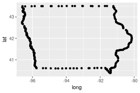<!-- --> ] .pull-right[ that are connected in the 'right' order <br>(determined by the variable `order` in the data) 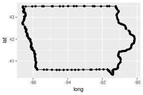<!-- --> ] --- ## Maps .pull-left[ The `group` aesthetic is used to distinguish between different regions 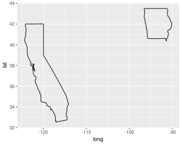<!-- --> ] .pull-right[ & those regions can be filled in <br/><br/> 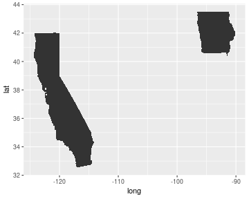<!-- --> ] --- ## Maps in code (1) ```r ggplot(states, aes(x = long, y = lat)) + geom_point() ``` 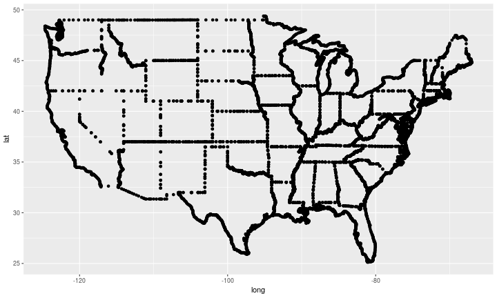<!-- --> --- ## Maps in code (2) ```r ggplot(states, aes(x = long, y = lat)) + geom_path(aes(group = group)) ``` 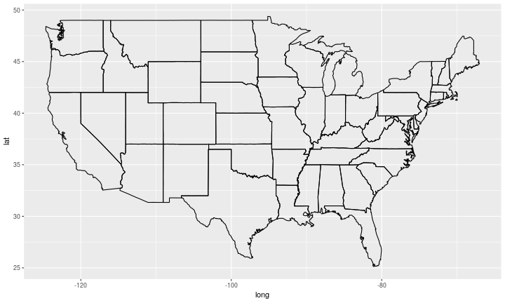<!-- --> --- ## Maps in code (3) ```r ggplot(states, aes(x = long, y = lat)) + geom_polygon(aes(group = group)) ``` 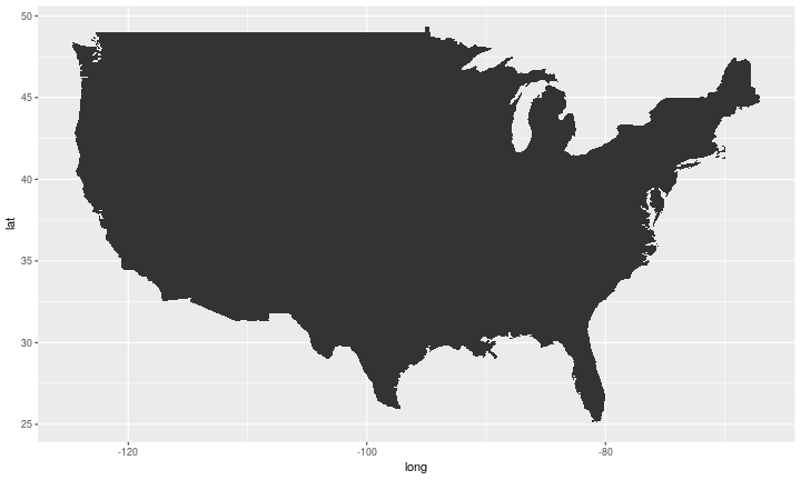<!-- --> --- ## Maps in code (4) ```r ggplot(states, aes(x = long, y = lat)) + geom_polygon(aes(group = group, fill=lat)) ``` 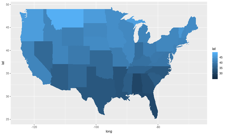<!-- --> --- ## World maps ```r world <- map_data("world") world %>% arrange(order) %>% ggplot(aes(x = long, y = lat)) + geom_polygon(aes(group=group), size=.1, colour="white") + theme_void() ``` 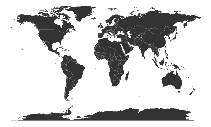<!-- --> --- class: yourturn # Your Turn - Use ggplot2 and pull out map data for all US counties: <br> `counties <- map_data("county")` - Draw a map of counties (polygons & path geom) - Colour all counties called "story" - **Advanced**: What county names are used most often? --- class: inverse, center, top background-image: url(https://github.com/allisonhorst/stats-illustrations/blob/master/rstats-artwork/sf.png?raw=true) background-size: 650px background-position: 50% 80% # map data: type 2 --- ## MAP DATA: TYPE 2 **Shapefiles**: - polygons: closed shapes such as country borders - lines: linear shapes that are not filled with any aspect, such as highways, streams, or roads - points: used to specify specific positions, such as city or landmark locations <br/><br/> **Why shapefiles?** A lot of government agencies use shapefiles to publish spatial information, such as states, counties, congressional districts, exact locations of state and national parks, etc. --- ## MAP DATA: TYPE 2 The sf package - tidyverse-compatible spatial data frames - "geometry" column stores the spatial information ```r library(sf) states <- USAboundaries::us_boundaries() states %>% select(name, geometry) %>% slice(1:10) ``` ``` ## Simple feature collection with 10 features and 1 field ## geometry type: MULTIPOLYGON ## dimension: XY ## bbox: xmin: -179.1743 ymin: 18.91747 xmax: 179.7739 ymax: 71.35256 ## CRS: EPSG:4326 ## name geometry ## 1 Maine MULTIPOLYGON (((-68.92401 4... ## 2 Hawaii MULTIPOLYGON (((-156.0497 1... ## 3 Arizona MULTIPOLYGON (((-114.7997 3... ## 4 Arkansas MULTIPOLYGON (((-94.61792 3... ## 5 Delaware MULTIPOLYGON (((-75.77379 3... ## 6 Georgia MULTIPOLYGON (((-85.60516 3... ## 7 Minnesota MULTIPOLYGON (((-97.22904 4... ## 8 Alaska MULTIPOLYGON (((179.4813 51... ## 9 California MULTIPOLYGON (((-118.594 33... ## 10 District of Columbia MULTIPOLYGON (((-77.11976 3... ``` --- ## `geom_sf()` `geom_sf()` requires the `geometry` aes value and will automatically detect column named "geometry" ```r states48 <- states %>% dplyr::filter(stringr::str_detect(name, "Hawaii|Alaska|Puerto", negate = T)) ggplot() + geom_sf(data = states48, aes(geometry = geometry)) ``` 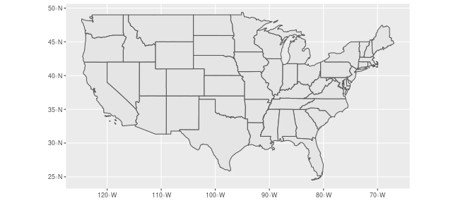<!-- --> --- ## `geom_sf()` Use the `fill` aes to color geometries by another variable in the data. ```r ggplot() + geom_sf(data = states48, aes(fill = name), show.legend = FALSE) ``` 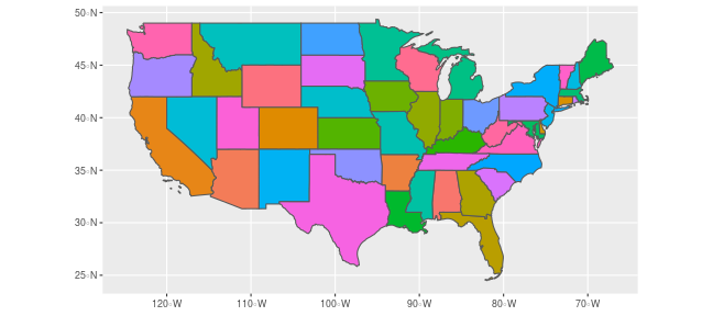<!-- --> ??? In this example, we color by the water area in the state. --- class: inverse, center, top background-image: url(https://angela-li.github.io/slides/2018-11-08/img/middle-earth.jpg) background-size: 650px background-position: 50% 80% # Fun with middle earth --- ## `read_sf()` Not just the government, dedicated fan bases alike provide information in shapefiles. The ME-DEM team recreates Tolkien's Middle Earth in shapefile format at https://github.com/jvangeld/ME-GIS <br> Read in the shapefiles: ```r roads <- read_sf("data/ME-GIS/Roads.shp") coastline <- read_sf("data/ME-GIS/Coastline2.shp") rivers <- read_sf("data/ME-GIS/Rivers.shp") cities <- read_sf("data/ME-GIS/Cities.shp") contours <- read_sf('data/ME-GIS/Contours_18.shp') forests <- read_sf('data/ME-GIS/Forests.shp') lakes <- read_sf('data/ME-GIS/Lakes.shp') ``` --- ## `geom_sf()` <br> Create a map with a layer for each shapefile: ```r p <- ggplot() + geom_sf(data = contours, color = '#f0f0f0', fill='#f0f0f0', size = 0.2) + geom_sf(data = forests, color = 'darkolivegreen3', fill='darkolivegreen3') + geom_sf(data = lakes, color = 'steelblue', fill='steelblue') + geom_sf(data = coastline, colour="grey40") + geom_sf(data = rivers, colour="steelblue", size=0.3) + geom_sf(data = roads %>% dplyr::filter(TYPE == "PRIMARY"), size = 0.5, colour="grey30") + geom_sf(data = cities) + theme_bw() ``` --- ```r p ``` 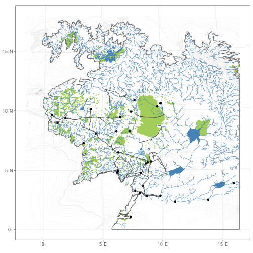<!-- --> --- ## `geom_sf_text()` & annotations <br> Add text to your map with `geom_sf_text()` and add annoatations with various functions from the `ggspatial` package: ```r library(ggspatial) p2 <- p + geom_sf_text(data = cities, aes(label=Name), vjust=-.5, size = 2.5) + annotation_scale() + annotation_north_arrow() ``` --- ```r p2 ``` <!-- --> --- class: yourturn # Your Turn For this question use `usa_sf()` from the albersusa package to retreive a U.S. state composite map as a shapefile. (run the code below) `# devtools::install_github("hrbrmstr/albersusa")` `library(albersusa)` `states <- usa_sf()` <br/><br/> Use `geom_sf()` and the `states` data to create a map of the US. --- class: inverse, center, top background-image: url(https://angela-li.github.io/slides/2018-11-08/img/xkcd-heatmap.png) background-size: 450px background-position: 50% 80% # Choropleth maps --- ## Choropleth maps - Choropleth maps are thematic maps: areas are shaded in proportion to the values of a variable - Join datasets: content + map --- ## Join content and map: content ```r data(fbi, package="classdata") fbi14 <- fbi %>% dplyr::filter(Year == 2014) head(fbi14) ``` ``` ## State Abb Year Population Type ## 1 Alabama AL 2014 4849377 Murder.and.nonnegligent.Manslaughter ## 2 Alaska AK 2014 736732 Murder.and.nonnegligent.Manslaughter ## 3 Arizona AZ 2014 6731484 Murder.and.nonnegligent.Manslaughter ## 4 Arkansas AR 2014 2966369 Murder.and.nonnegligent.Manslaughter ## 5 California CA 2014 38802500 Murder.and.nonnegligent.Manslaughter ## 6 Colorado CO 2014 5355866 Murder.and.nonnegligent.Manslaughter ## Count Violent.crime ## 1 276 TRUE ## 2 41 TRUE ## 3 319 TRUE ## 4 165 TRUE ## 5 1699 TRUE ## 6 151 TRUE ``` --- ## Join content and map: map ```r states <- map_data("state") head(states) ``` ``` ## long lat group order region subregion ## 1 -87.46201 30.38968 1 1 alabama <NA> ## 2 -87.48493 30.37249 1 2 alabama <NA> ## 3 -87.52503 30.37249 1 3 alabama <NA> ## 4 -87.53076 30.33239 1 4 alabama <NA> ## 5 -87.57087 30.32665 1 5 alabama <NA> ## 6 -87.58806 30.32665 1 6 alabama <NA> ``` --- ## Prepare for join - want to combine fbi and states by state name, but we need to make the spelling the same - for simplification, introduce new variable with all lower case letters - generally, content data is more important, but we will see missing states on the map: `anti_join()` ```r fbi14$region <- tolower(fbi14$State) nomatch1 <- fbi14 %>% anti_join(states, by="region") # States for which we do not have map data unique(nomatch1$State) ``` ``` ## [1] "Alaska" "Hawaii" "Puerto Rico" ``` ```r nomatch2 <- states %>% anti_join(fbi14, by="region") # States for which we do not have crime data unique(nomatch2$State) ``` ``` ## NULL ``` --- ## Join and then map ```r fbi.map <- fbi14 %>% left_join(states, by="region") fbi.map %>% dplyr::filter(Type=="Burglary") %>% ggplot(aes(x = long, y = lat, fill=Count/Population)) + geom_polygon(aes(group=group)) ``` <!-- --> --- class: yourturn # Your Turn - Draw a choropleth map of the rate of motor vehicle thefts in 2012 across the US. - `scale_fill_gradient2()` allows you to set a color scheme with two main colors. Read up on it and change the scheme in the first choropleth map. --- ## Geographic data in layers - For data collected with GPS coordinates we can use maps as background layers - In that situation, we do not need to join the map information and the content data, but use layers with separate data sets of the form ```r map %>% ggplot(aes(x = long, y = lat)) + geom_polygon(aes(group = group)) + geom_point(data = content, aes(x=longitude, y = latitude)) ``` --- ## FARS data - US Department of transportation is keeping a record of every accident that results in a fatality in the FARS Data base (fatal accident report system, http://www.nhtsa.gov/FARS) - FARS consists of 20+ tables consisting of various aspects of each accident - Documentation at https://www-fars.nhtsa.dot.gov/Main/index.aspx - three of the main tables are `accident`, `person`, and `vehicle` --- ## Data - Data of all accidents are available at: ```r acc <- read.csv("https://raw.githubusercontent.com/DS202-at-ISU/labs/master/data/fars2016/accident.csv", stringsAsFactors = FALSE) names(acc) ``` ``` ## [1] "STATE" "ST_CASE" "VE_TOTAL" "VE_FORMS" "PVH_INVL" ## [6] "PEDS" "PERNOTMVIT" "PERMVIT" "PERSONS" "COUNTY" ## [11] "CITY" "DAY" "MONTH" "YEAR" "DAY_WEEK" ## [16] "HOUR" "MINUTE" "NHS" "RUR_URB" "FUNC_SYS" ## [21] "RD_OWNER" "ROUTE" "TWAY_ID" "TWAY_ID2" "MILEPT" ## [26] "LATITUDE" "LONGITUD" "SP_JUR" "HARM_EV" "MAN_COLL" ## [31] "RELJCT1" "RELJCT2" "TYP_INT" "WRK_ZONE" "REL_ROAD" ## [36] "LGT_COND" "WEATHER1" "WEATHER2" "WEATHER" "SCH_BUS" ## [41] "RAIL" "NOT_HOUR" "NOT_MIN" "ARR_HOUR" "ARR_MIN" ## [46] "HOSP_HR" "HOSP_MN" "CF1" "CF2" "CF3" ## [51] "FATALS" "DRUNK_DR" ``` --- class: yourturn # Your Turn - Use the accident data to plot the geographic location of all accidents in the US in 2016. - Plot accidents on a map of the US (use the map of the US as first layer) - Why would it be tricky to plot a choropleth map of the number of accidents by state? --- class: yourturn # Your Turn - The numbers for each state (`STATE`) are so-called fips codes. - Sketch out the steps necessary to draw a choropleth map of the rate of fatal accidents by state. --- ## Resources - reference/document: http://ggplot2.tidyverse.org/reference/ - RStudio cheat sheet for [ggplot2](https://www.rstudio.com/wp-content/uploads/2015/03/ggplot2-cheatsheet.pdf) - Artwork by [@allison_horst](https://twitter.com/allison_horst?ref_src=twsrc%5Egoogle%7Ctwcamp%5Eserp%7Ctwgr%5Eauthor) - Some material taken from [Angela Li](bit.ly/dc-spatial) - Some material taken from [Sam Tyner](https://sctyner.github.io/user20-proposal.html)